Betwixt and Between:
Covering Fantasy
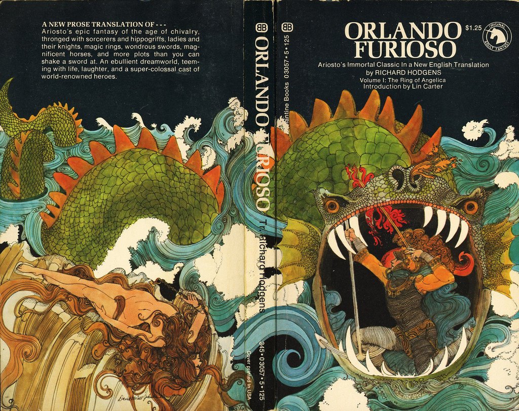
A cover by David Johnston
Books and their covers: I know, one shouldn’t judge the former by the latter. But once in a while a cover can shape the way one reads the book. And the way it lingers in one’s mind long after.
Gervasio Gallardo, one of the most iconic of the illustrators of fantasy covers in the '70s.
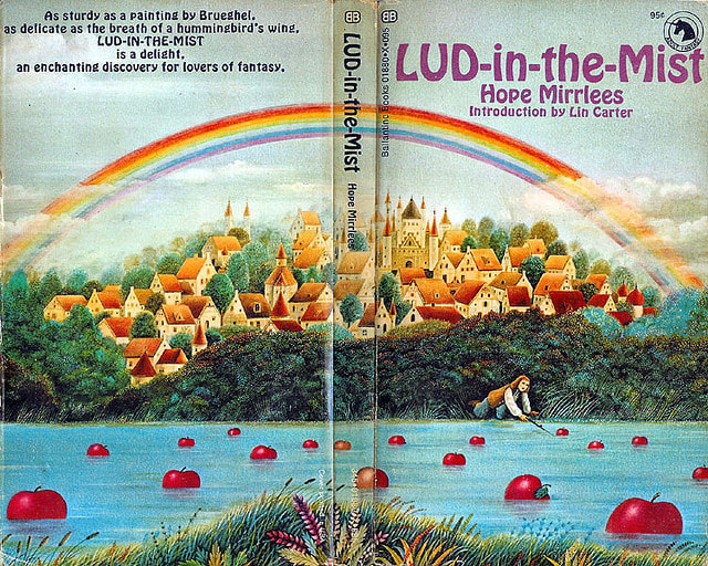
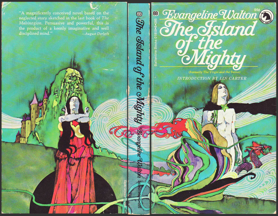
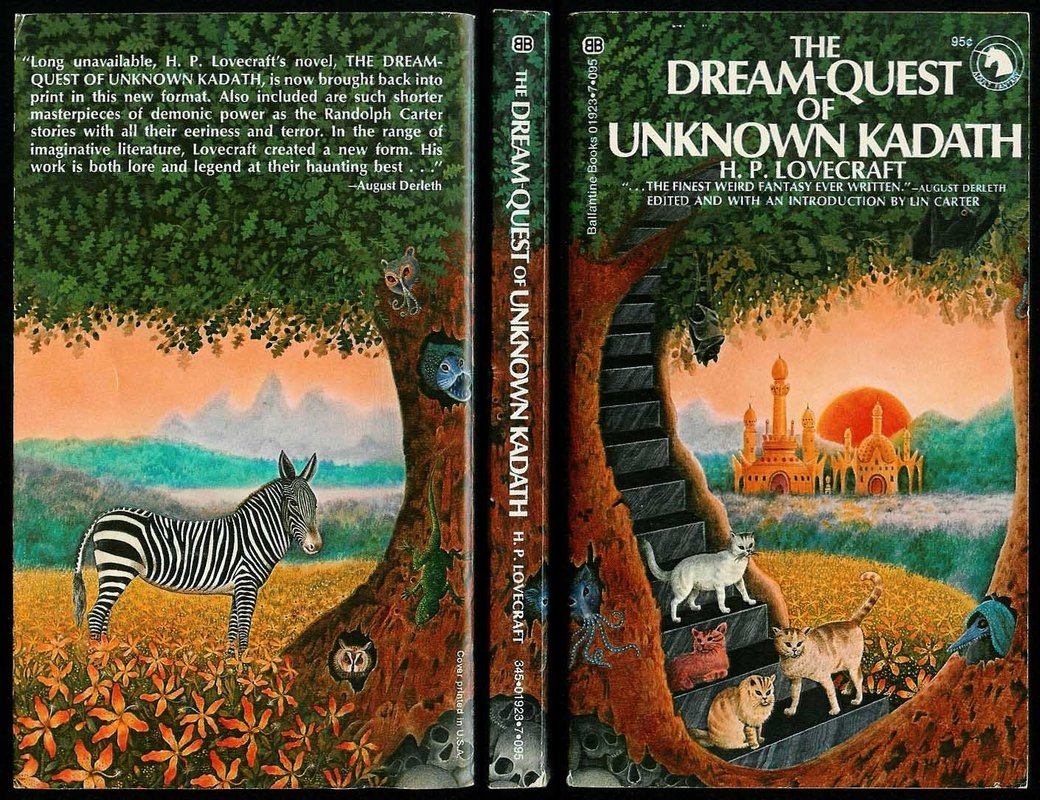
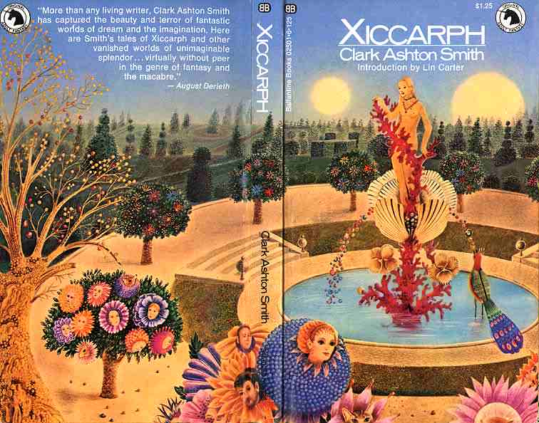
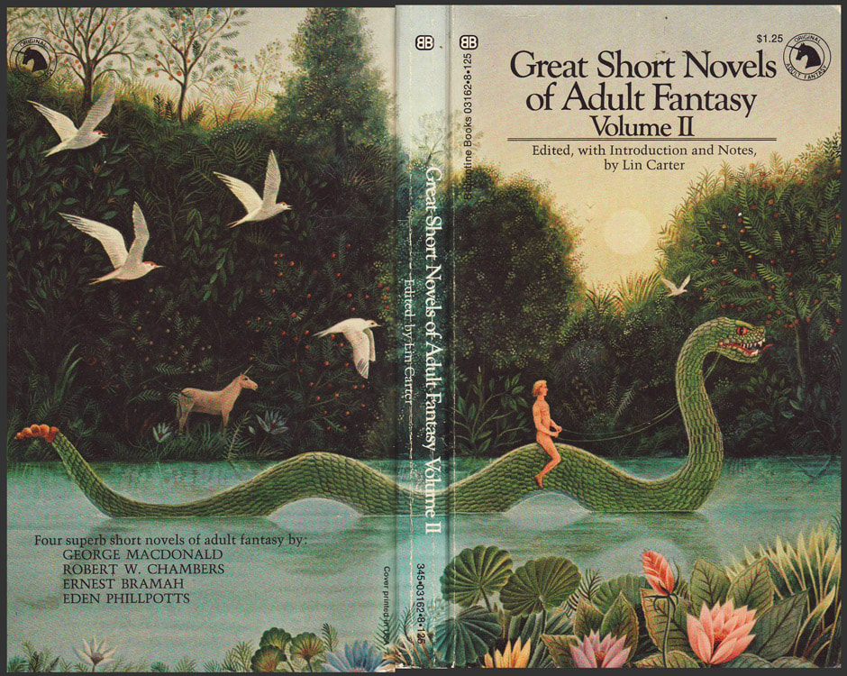
Case in point: The Ballantine Adult Fantasy series, published beginning in 1969 and continuing on through the decade of the seventies.
The kind of beautiful and terrifying Robert LoGrippo
In an effort to capitalize on the underground success of Tolkien’s work in the late ‘60’s, Ian and Betty Ballantine hired Lin Carter to edit a series focusing on overlooked or unknown writers of fantastic fiction, from Tolkien’s era and before.
David Johnston
The Ballantines were wise or lucky in putting Lin Carter in charge. The man had read everything – a fact that didn’t always serve him. As a writer of fantasy, he could be flagrantly derivative and graceless even for a young reader like myself. With all my pre-adolescent naiveite, I couldn’t get past a title like Thongor Fights the Pirates of Tarakus.
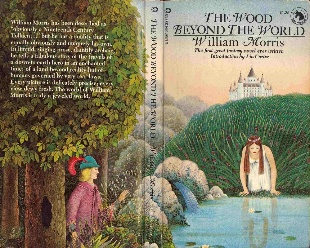
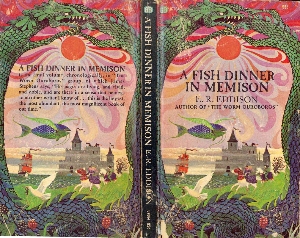
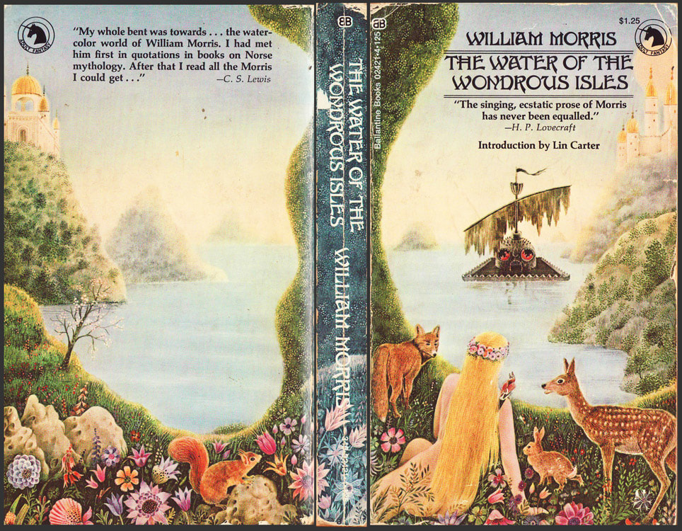
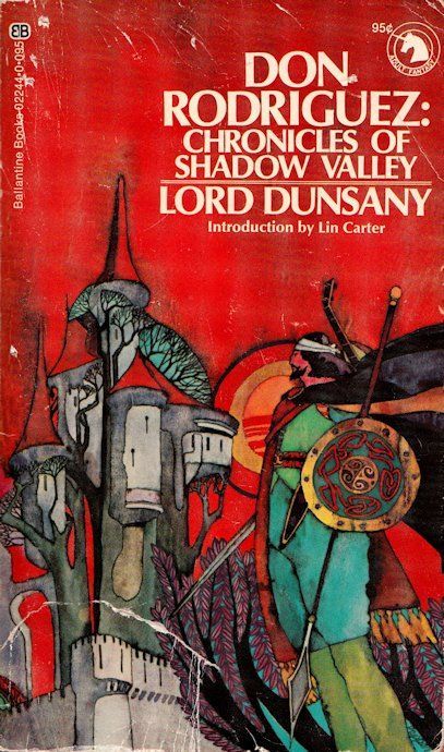
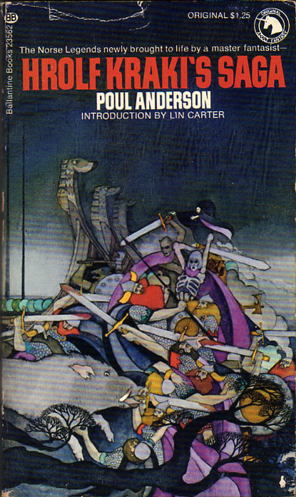
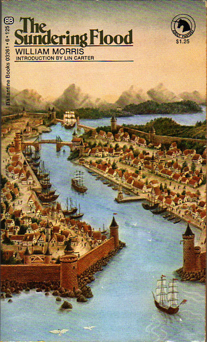
But as an editor, Carter was pretty amazing. He could tease out some of the threads that made Tolkien so popular, and find them running through many old books which he dusted off and made available again. I have Carter to thank for introducing me to people like Lord Dunsany, E. R. Eddison, and (most lastingly, for me) William Morris.
But as an editor, Carter was pretty amazing. He could tease out some of the threads that made Tolkien so popular, and find them running through many old books which he dusted off and made available again. I have Carter to thank for introducing me to people like Lord Dunsany, E. R. Eddison, and (most lastingly, for me) William Morris.
From the top: covers by Bob Pepper, Barbara Reminton, Gallardo.
AND… the Ballantines made some terrific decisions in choosing the format of the books – inexpensive paperbacks with fantastic, incandescent covers. They hired contemporary artists who shared a distinctly 60’s fantasy aesthetic: color-steeped, baroquely ornamented, striking abstracted figures, often utterly unrelated to the text between the covers.
|
|
|
|
Clockwise from top left: Johnston, Pepper, Gallardo, Pepper
Barbara Remington, who designed the hallucinogenic cover for the Ballantine edition of The Lord of the Rings, says she hadn’t even read the book when she painted the commissioned cover.
And that’s just fine. The covers of the Ballantine Adult Fantasy series didn’t illustrate the worlds contained therein – how could the impossible be depicted? And what violence is done to a dream in the drawing of it?
|
|
|
|
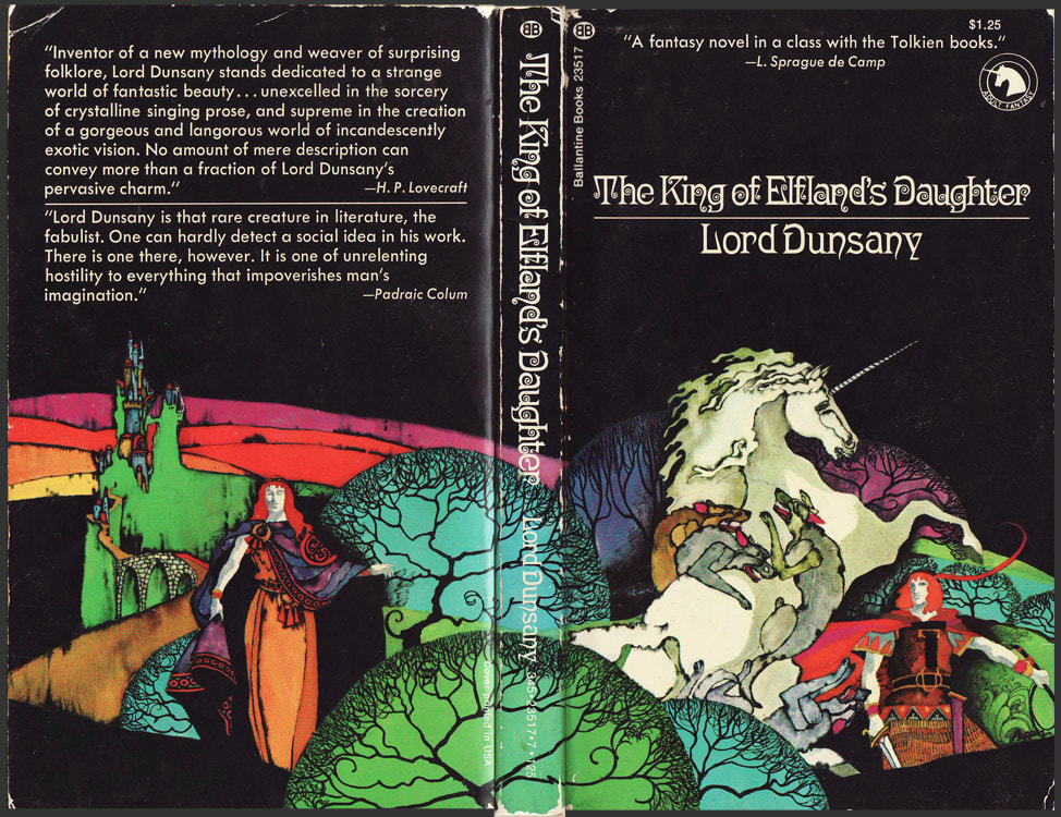
Gallardo, Johnston, Gallardo, Gallardo.
No, let each reader envision impossible worlds for herself. Let covers provide that visual kick, jarring the imagination loose from that which weights it, and launches it into the mysterious Otherworlds contained between and betwixt.
|
|
Ray Cruz and Gallardo.
In my early adulthood I went on a quest to track down and purchase as many of these mouldering old paperbacks as I could find. As it does with everything, the internet cheapened the quest, making it disappointingly easy.
|
|
Johnston and Gallardo
But time has made these books fragile. Their pages are crisp and yellow, and many of them I’m afraid to crack open.
Gallardo, above and below
That’s okay. I have other less delicate editions of the ones I can bear to reread. And for the others – the words are still there, between covers that will last long after the pages have crumbled, if only in my imagination.

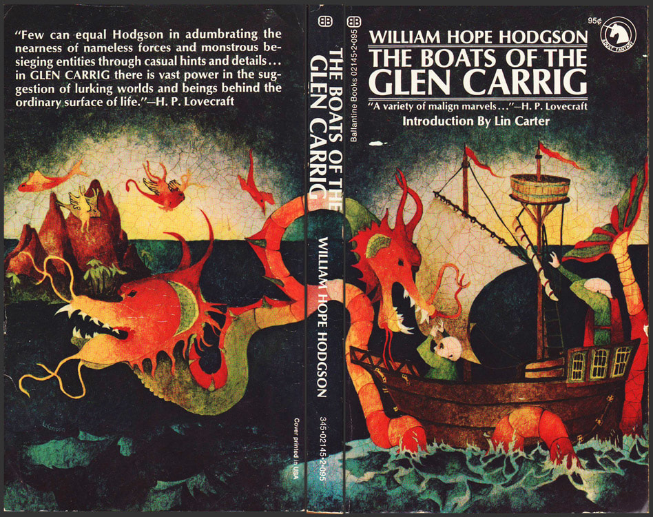
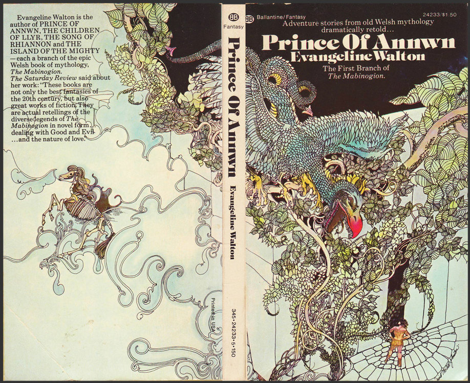
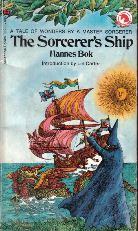
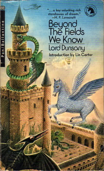
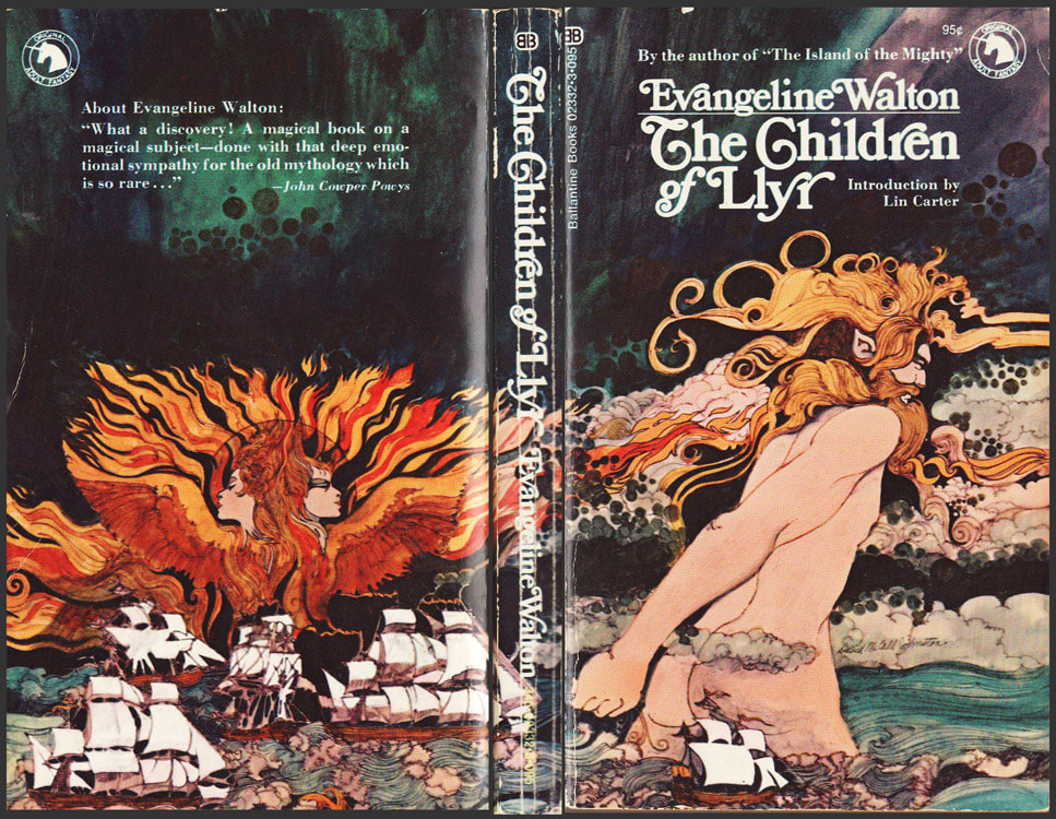
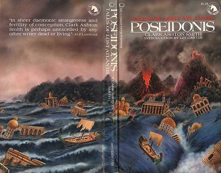
(Some other lovely covers I couldn't bear to leave out)